Cohorts: because averages hide the pattern

When I first started using good metrics (I was no longer focussing on vanity metrics like total registered users) I had a hard time wrapping my head around Retention. What does it mean when you have 25% active users. Do they come back every day? Or every week? How do you measure that 25%? It took me a while to figure it out. In the previous blogpost about the Pirate Metrics, I wrote:
“What I usually do is pick a moment in the future of new users and measure how many of those users are still active (read: performing the key activity) at that moment of time.”
The problem with this is that if we look at all the users who are still active 4 weeks after they signed up, the averages hide the pattern. That is because there is a second important question to ask.
We not only want to know what moment in the future you took as reference point, but also how long ago it was the user signed up. A user that signed up over 2 months ago, is not the same user who signs up today. Your product is probably different, your marketing is different and you might even target a different user segment. That’s why we’d like to use Cohorts.
A cohort is a group of subjects who have shared a particular event together during a particular time span. Cohorts may be tracked over extended periods in a cohort study. Wikipedia
Sounds hard? Wait until you see them in a diagram:
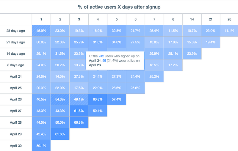
Cohorts look intimidating. Especially if you see them for the first time They are not easy to understand, but they answer my two important questions. Let’s dive into the diagram and let me explain how to read a Cohort diagram displaying when users signed up versus the retention rate per day:
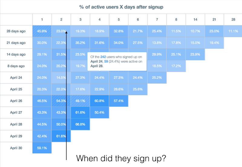
Vertically this Cohort diagram shows when the user signed up. The bottom row is usually today or this week.
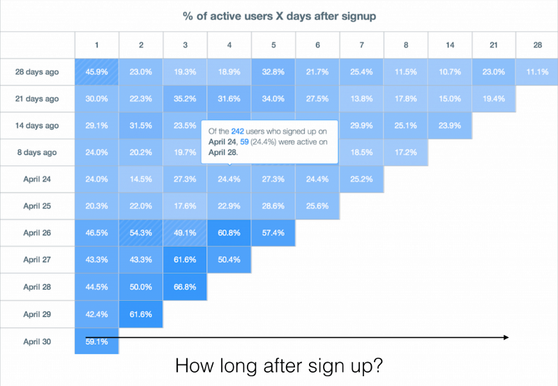
Horizontally this diagram shows you the percentage of users who are still active (read: still performing your key activity) after a certain amount of time.
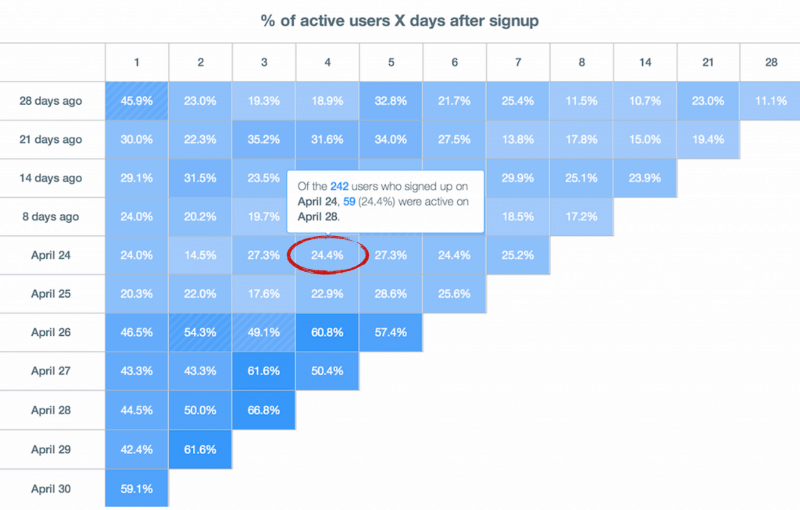
When you say you have X% active users, you also have to tell that you looked at users that signed up Y days ago and we still active after Z days. In this example: 7 days ago and after 4 days, almost 25% is still active.
There is another added benefit of using cohort diagrams. It shows you if all the hard work you put in your product is working or not:
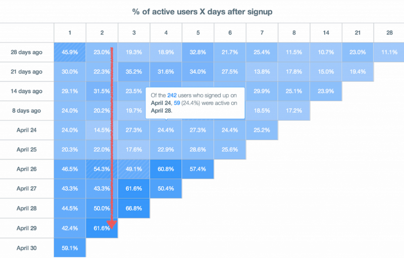
If all goes right, the numbers should go up the further you get down (and towards today). All the changes you make should have a positive effect on your retention. That’s why it is also smart to tag your releases:
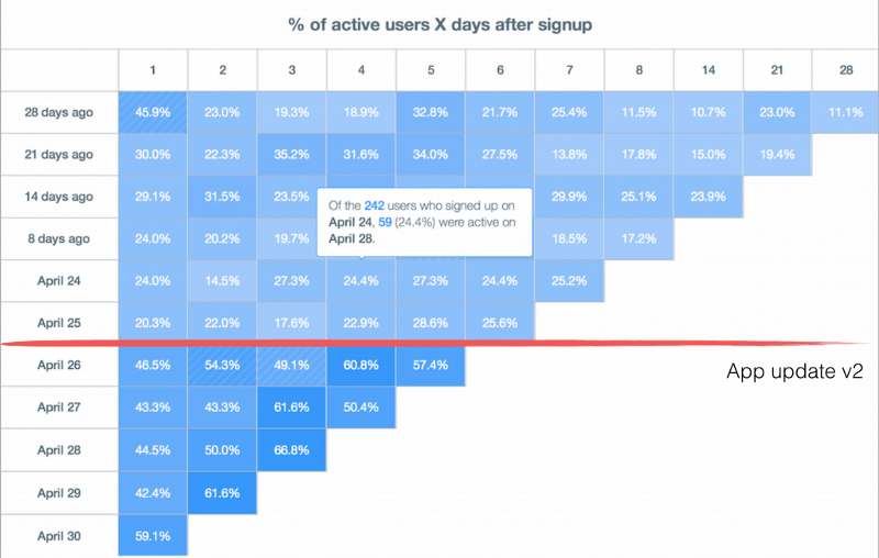
In this hypothetical case the v2 app update caused a big jump in retention. From around 25% to 60%. Seems like we are now creating a lot of happy users!
Next steps
In this example we used days as our time span, but I prefer to use weeks. Users may be coming back every week and still be active over a longer period of time, even if they do not use your product every day. A startup selling razor blades may even look at months instead of weeks.
We also only looked at users signing up, but you could easily create a cohort diagram of users purchasing a product (vertical axis) and what percentage came back and purchased a product again (horizontal axis). Or users from different customer segments (vertical) that perform your key activity over a certain period of time (horizontal), to see what segment gets the most added benefit from your current solution.
The important lesson to remember is that averages hide the pattern. It is important to distinguish different types of users. Whether the difference is time or customer segment. You learn more the deeper you dive!

Timan Rebel has over 20 years of experience as a startup founder and helps both independent and corporate startups find product/market fit. He has coached over 250+ startups in the past 12 years and is an expert in Lean Innovation and experiment design.
